Viva Magenta - Pantone's 2023 colour of the Year
The Pantone Matching System is an internationally recognized system of colour standardization. It is used primarily by fashion and product designers, graphic artists and printers.
Every December, Pantone announces its colour of the year for the coming year. The colour is chosen with great deliberation (and this year, with a little help from AI). It is meant to represent the characteristic spirit of our time, our culture and our collective mood.
The 2023 colour of the year is Viva Magenta. Pantone describes it as: "Powerful and empowering, it is an animated red that encourages experimentation and self-expression without restraint. Audacious, witty, and inclusive of all, Viva Magenta welcomes anyone and everyone with the same rebellious spirit." Sounds spicy!
Why is this important? Well, Pantone’s colour of the year is a trend forecaster. When the colour of the year is announced, those colors start to show up all over the place from branding to products, to home decor, and even to art. There are businesses that wait until Pantone announces the winning colour before launching products. Keep an eye on clothing. You are going to start seeing a lot more plums, deep pinks, burgundies and magentas.
I find this influence of colour fascinating. I like to think that I am not susceptible to colour trends. After all, I don’t need Pantone to tell me what colours I like, right? Wrong. Well, partially. I will always like Robin’s Egg blue but maybe I am going to pay magenta a little more attention now. Likely because it has been placed in my consciousness thanks to Pantone.
I deeply consider colour in all my painting. I work to create a harmonious palette but often add an unexpected colour for a little discord. If I am doing a piece that references another era, I research the popular colours from that time and replicate them. With portraiture, I use yellows in the forehead, reds/pinks in the mid face and blues in the jaw. I consider cool colours (for the shadow side) and warm colours (for the lighted side). If I want to dull down the chroma (brightness) of a colour, I will add a touch of complementary colour. So, to knock back the intensity of Viva Magenta, I would add a bit of viridian green. The choices and science of colour mixing are some of the reasons why I love painting.
The background of this painting I did a few months ago is pretty well spot-on Viva Magenta. The colour scheme is predominantly complementary (purple and yellow are opposite of each other on the colour wheel) which creates impact. Fun fact, many of the colours associated with our holiday seasons are complementary (red/green for Christmas, purple/yellow for Easter).
Look for viva magenta in 2023!
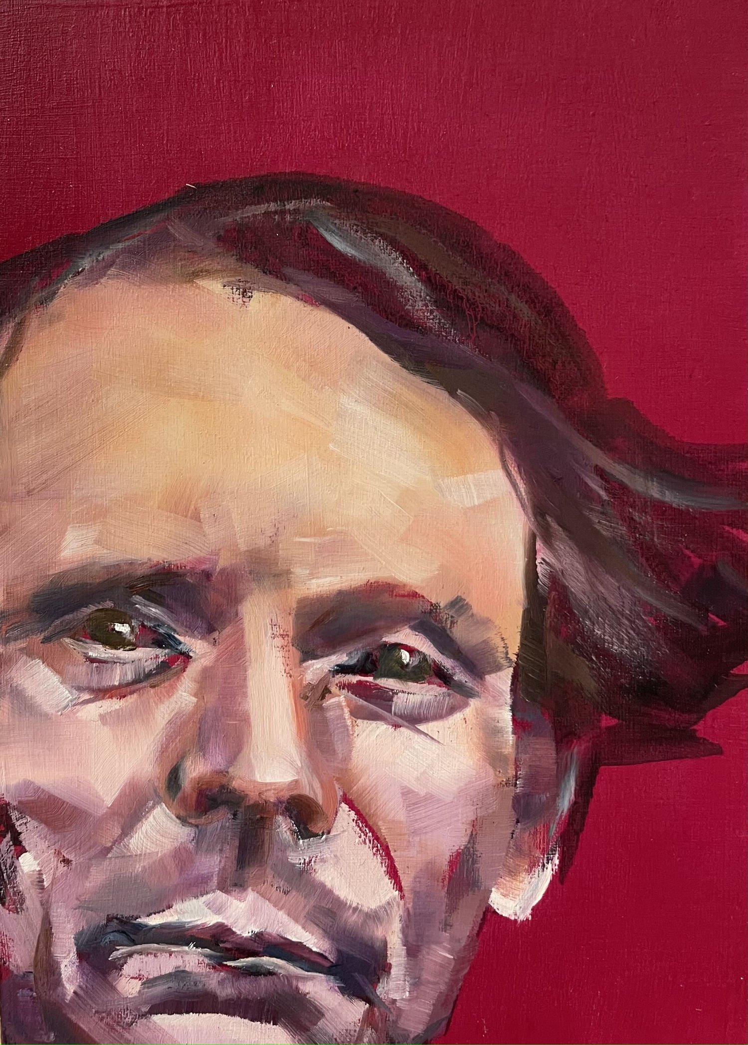
Vintage Portrait (magenta), oil on cradled wood panel, 5” x 7”
(available at Nanaimo Art Gallery)
If this blog interests you, consider signing up for my monthly newsletter here. I write about random stuff, mostly art-related. I also announce new work and art events.